From terra-cotta to rammed earth and mass timber assemblies, AN has gathered its top facades highlights from 2022. Marking a year in which environmental standards continued to push the evolution of the building envelope, architects responded to energy concerns with a wide range of material palettes that offer envelope solutions across climate zones. The following list includes residential buildings, offices, a nursing home, and even a greenhouse, but they all share the same concern for innovative design and elevated construction.
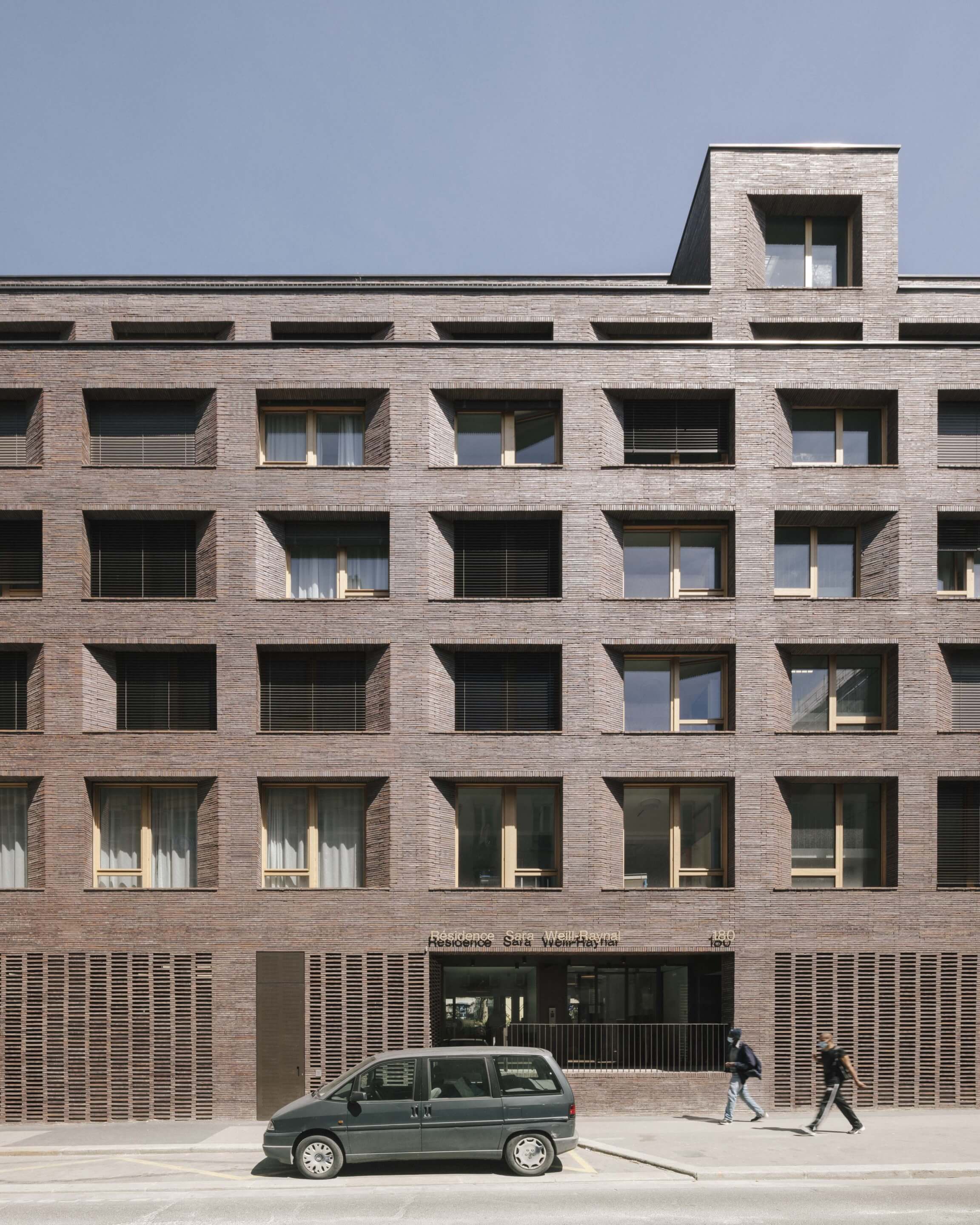
Sara Weill-Raynal Nursing Home
Avenier Cornejo architectes
Paris
Paris-based Avenier Cornejo architectes extended and restructured the Sara Weill-Raynal Nursing Home enveloped in a brown-gray Kolumba brick facade. The addition was completed without expanding the building’s footprint, and utilized the existing structural skeleton of the building. Complete with two additional setback floors, Avenier Cornejo sought to “establish a sense of programmatic coherence and urban legibility,” according to partners Christelle Avenier and Miguel Cornejo, wrapping the entire building in brick. Chosen for their length and durability, the Kolumba brick is also adaptable under varying climatic conditions.
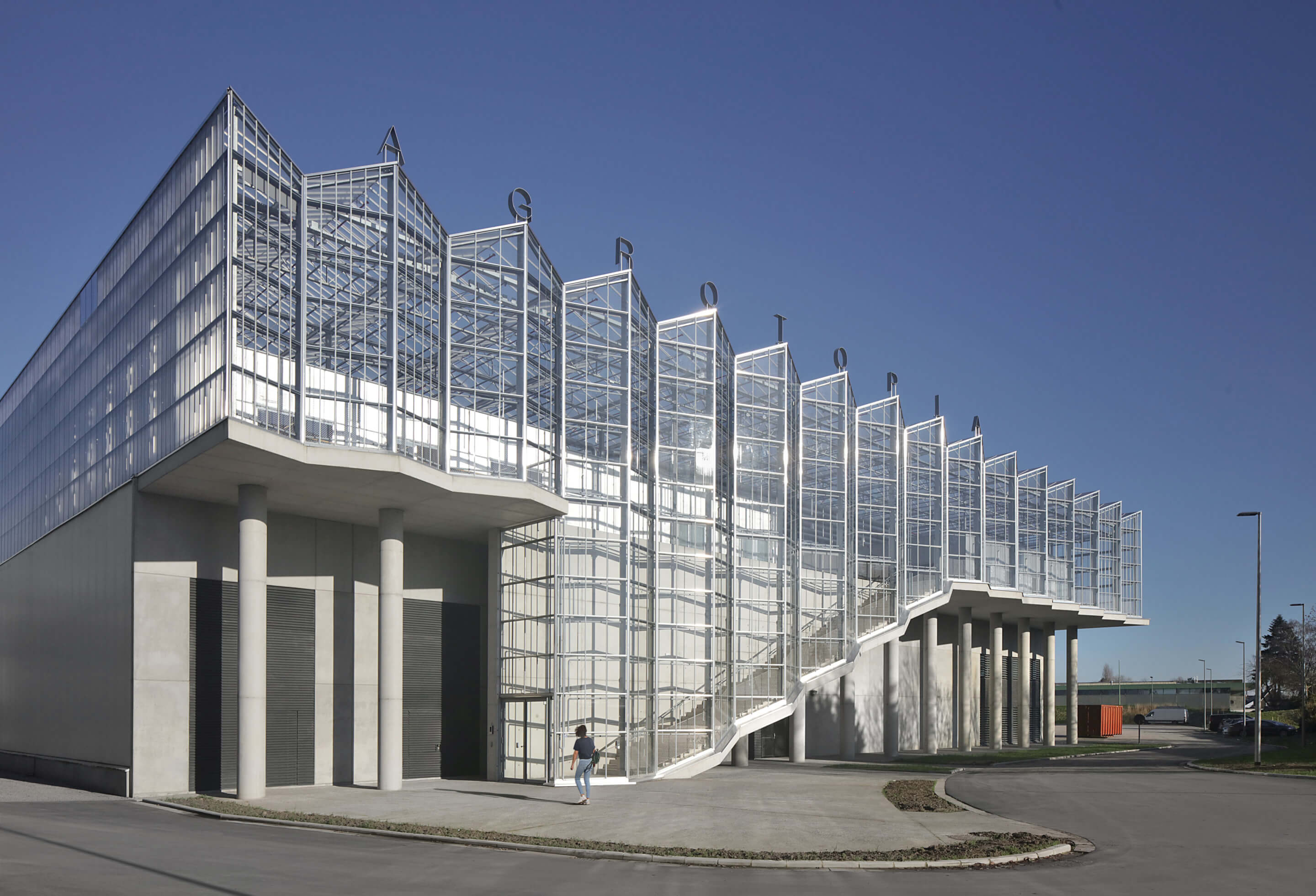
Agrotopia
META architectuurbureau and van Bergen Kolpa Architecten
Roeselare, Belgium
META architectuurbureau and van Bergen Kolpa Architecten’s expansion of a greenhouse in West Flanders, Belgium, optimizes agricultural production under a glass and steel facade. Built as an addition above an existing concrete building, the greenhouse’s heat gain, moisture levels, and daylighting had to be highly controlled. To achieve this, the architects opted for diffuse glass with a particularly high haze factor, increasing crop yields, screens for solar shading, and a rainwater collection system for the roof. The interior climate is further controlled through surplus heat from a waste incinerator, raising the interior temperature, and recycled irrigation run-off.
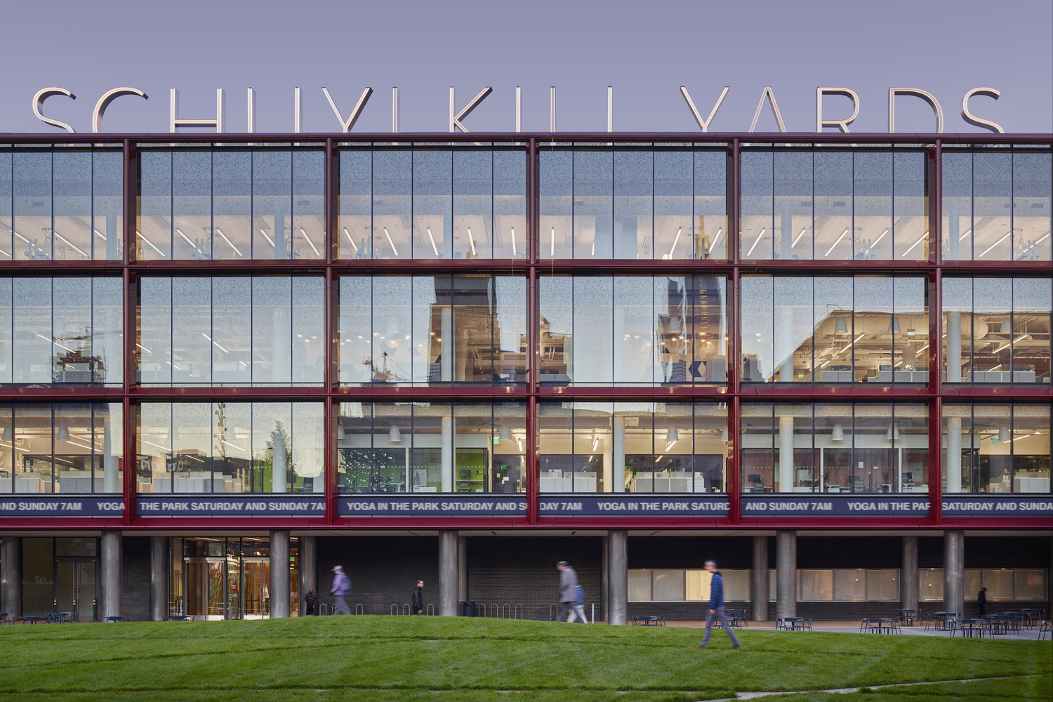
Bulletin Building
KieranTimberlake
Philadelphia
KieranTimberlake has transformed a 1950s newspaper headquarters into a life sciences building. The Bulletin Building in Philadelphia marks an impressive facade transformation as an adaptive reuse project. The architects sought to bring in daylight while minimizing solar glare, demolishing the main brick facade for a high-performance curtain wall that is shaded by an outboard aluminum frame. On the other faces of the building, the original masonry was cleaned with individual blocks replaced in places deemed necessary. To complete the transformation of the building into a Class A life science space, the design team chose a “unitized” curtain wall equipped with full-height clear, glazed panels for the east-facing main elevation, revealing views to the open floor plates.
33 Park Row
RSHP
New York
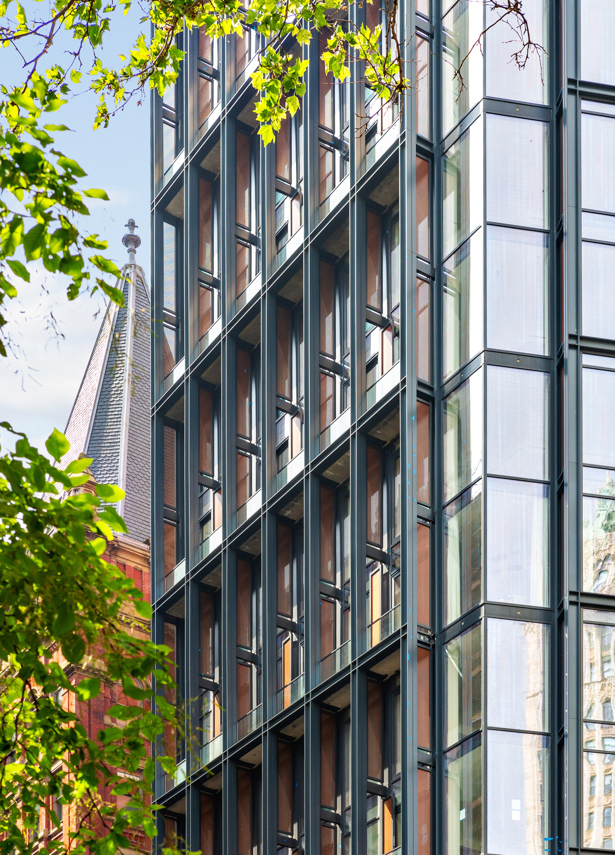
RSHP’s 33 Park Row topped out at 377 feet in Manhattan’s Financial District earlier this year, with a set back core and two primary exposures that fanned out the interior spaces. On 33 Park Row’s facades, patinated copper screens were integrated into metal sections fabricated, and reddish fins marked out loggias that add depth and rhythm to the facade surface while delineating the residences and amenities from the lower retail floors. For the windows—which offer residents floor-to-ceiling views—the architects specified laminated, double-glazed IGUs with a low-e coating in conjunction with multipane unitized panels, allowing for ample sunlight within a high performance glazing system.
Grand Morillon
Kengo Kuma & Associates
Geneva
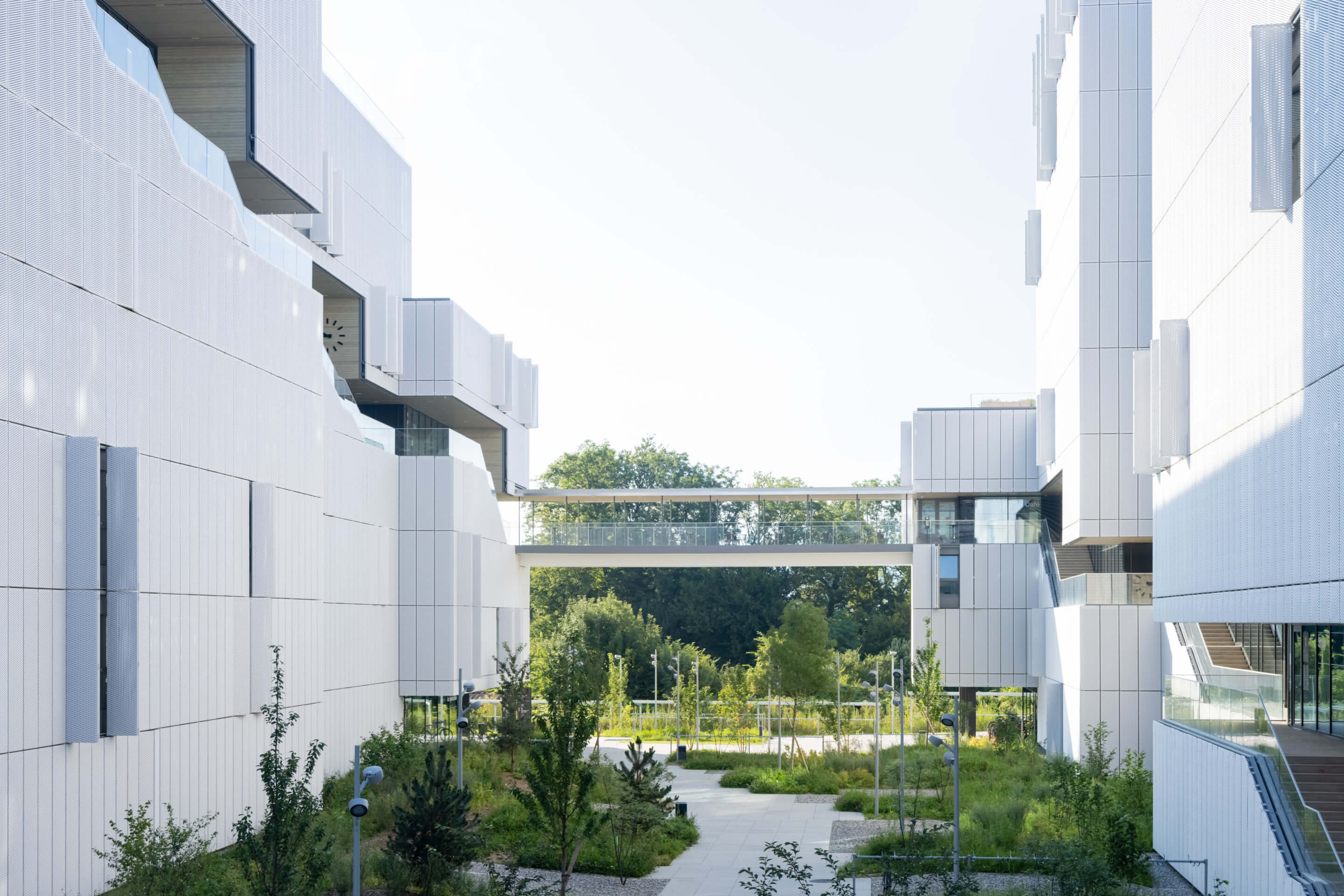
Featuring a stepped promenade that cuts through an otherwise uniform grid of operable screened windows, Kengo Kuma & Associates’ (KKAA) residences for students at the Graduate Institute of International and Development Studies in Geneva challenges the separation of public and private spaces of a traditional dormitory. From the exterior, the building’s surfaces are defined by the large expanses of its operable facade. Each student apartment has two windows covered by four foldable metal mesh screens, “conceived to be coherent at all scales,” KKAA partner-in-charge JavierVillar Ruiz said. The pattern of open and closed shutters varies with the seasons and the time of day, creating a shifting expression of collective student life.
Cornellà Housing
Peris+Toral Arquitectes
Cornellà de Llobregat, Catalonia, Spain
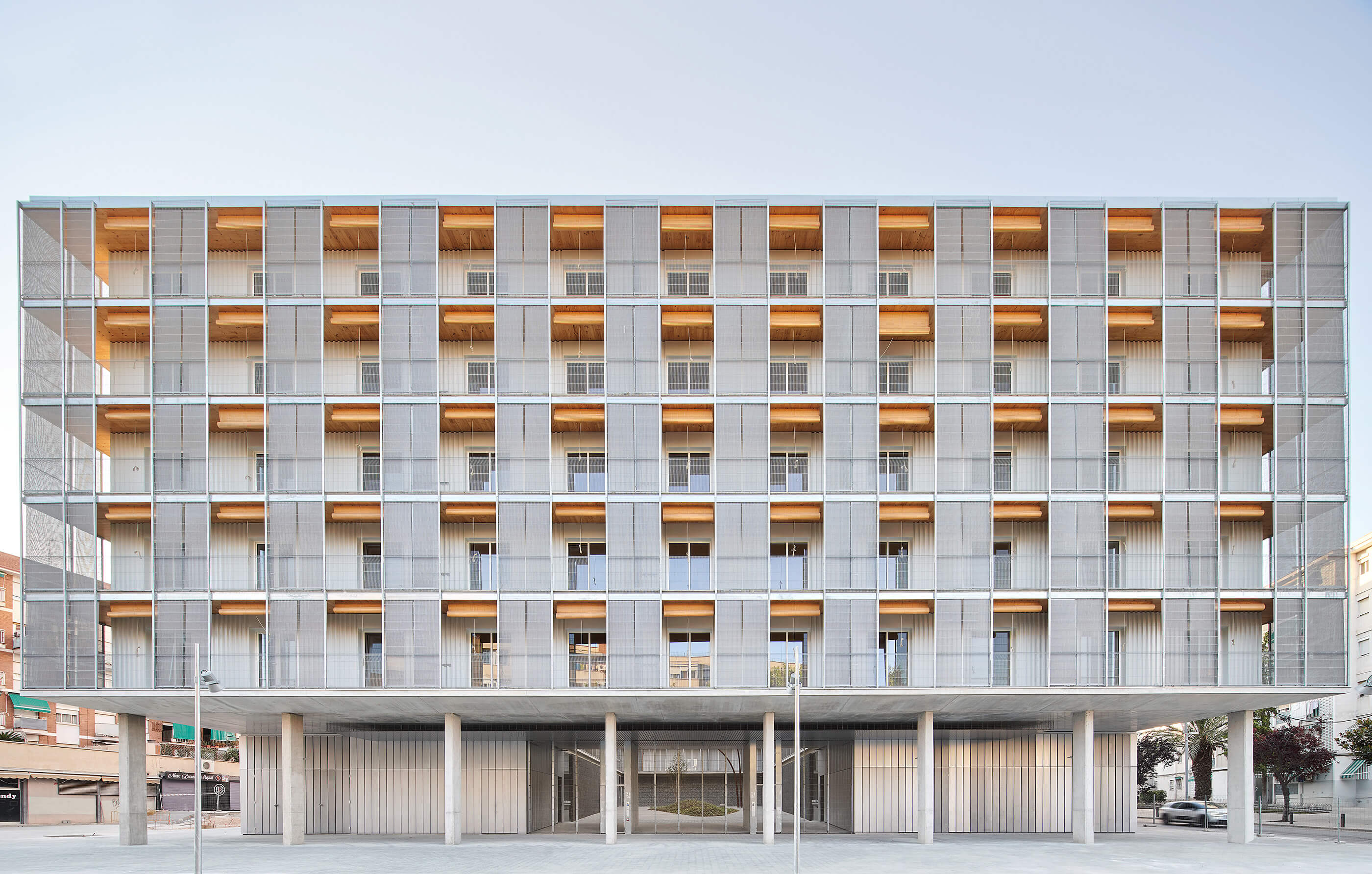
Peris+Toral Arquitectes’s 85 Social Dwellings in Cornellà is Spain’s largest wood-structure residential building. The exterior of the social housing project is wrapped in metal-screened terraces, eliminating the need for interior corridors with a series of courtyard entrances that allow residents to access their apartments through the terraces. The use of wood, which is exposed on terrace roofs, also allowed for an industrialized production process that improved quality control and reduced carbon dioxide emissions. Peris+Toral co-founder José Toral told AN that the facade was designed to “account [for] solar protection in summer from the Mediterranean climate,” with “fixed textile sun protection used in front of the opaque parts of the façade and wooden roller shutters in front of the windows.”
Quay Quarter Lanes
Studio Bright
Sydney
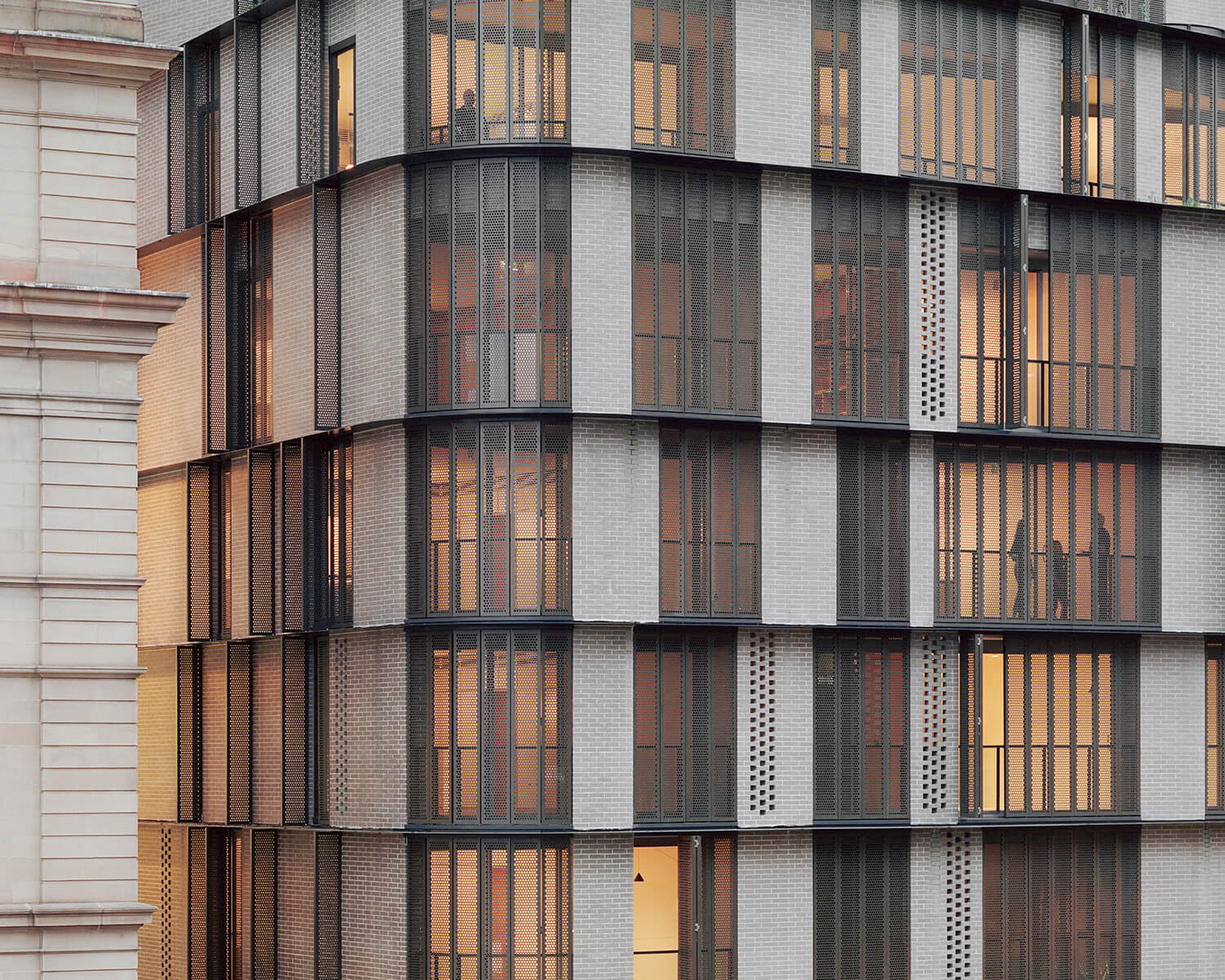
Studio Bright’s project at 8 Loftus Street in Sydney, Australia, is faced with a combination of brick panels, perforated brick screens, and horizontal black steel ribbons, organized within a vertical logic to interlace across the facade. Perforated bronze-anodized screens that offer solar shading and privacy for residents complete the rest of the facade. Part of a neighborhood reinvigoration, the facade pays homage to nearby heritage buildings with its earthy palette. Studio Bright director Melissa Bright described the overall appearance of Quay Quarter Lanes as “responding to a marketing imperative for high quality without excess.”
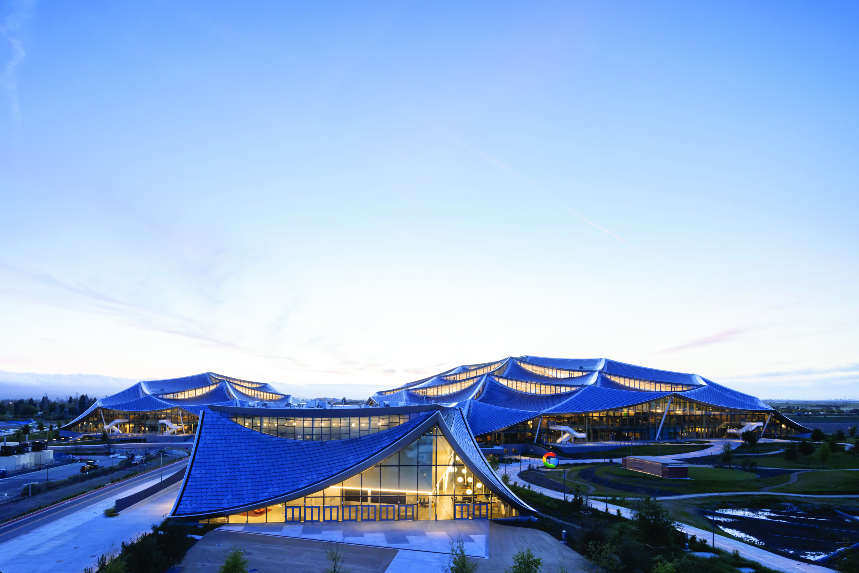
Google Bay View
Heatherwick Studio, BIG
Mountain View, California
Google’s most recent Silicon Valley outpost is framed by a bold, curving lightweight canopy that comes with an even bolder commitment to operate every hour of every day on carbon-free energy. Designed by BIG and Heatherwick Studio, the near-catenary canopies of overlapping gray roof scales hold photovoltaic panels and laminated glass. Their shingles are straight, but the design team “effectively redesigned” their subframes to support them on a doubly curved substrate. The scales generate 40 percent of the building’s energy, and the roof’s rainwater harvesting system helps the building meet 100 percent of the demand for nonpotable water.
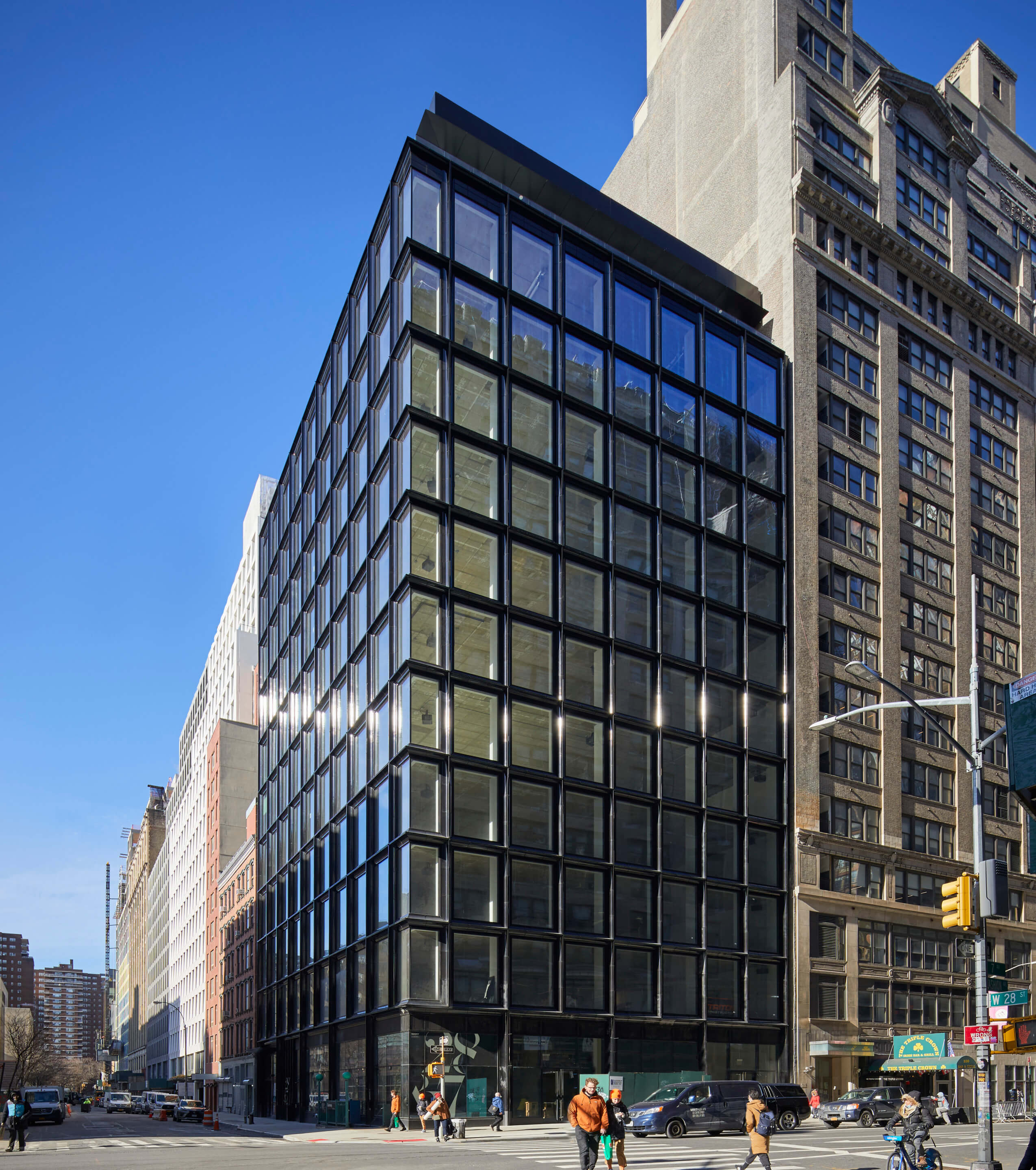
28&7
Skidmore, Owings, and Merrill
New York
In February, Skidmore, Owings, and Merrill (SOM) marked the completion of its slick, black terra-cotta and glass gridded 28&7. Named for the intersection it sits on in Chelsea, Manhattan, SOM Partner Chris Cooper told AN that 28&7 has a “typical New York City backdrop.” In selecting black-glazed terra-cotta—customized by Shildan—the team at SOM was able to harmoniously contrast 28&7 with the surrounding gray and tan stone buildings. The terra-cotta grid is divided on a “nominal” 10-foot module, providing tenants flexibility within office spaces. Cooper said the team carefully studied the profile, color, and texture of the terra-cotta to understand how the material interacted with glass and light. After considering ribbed and fluted profiles for the terra-cotta frame, the design chose hollowed tiles to complement the flat glass.
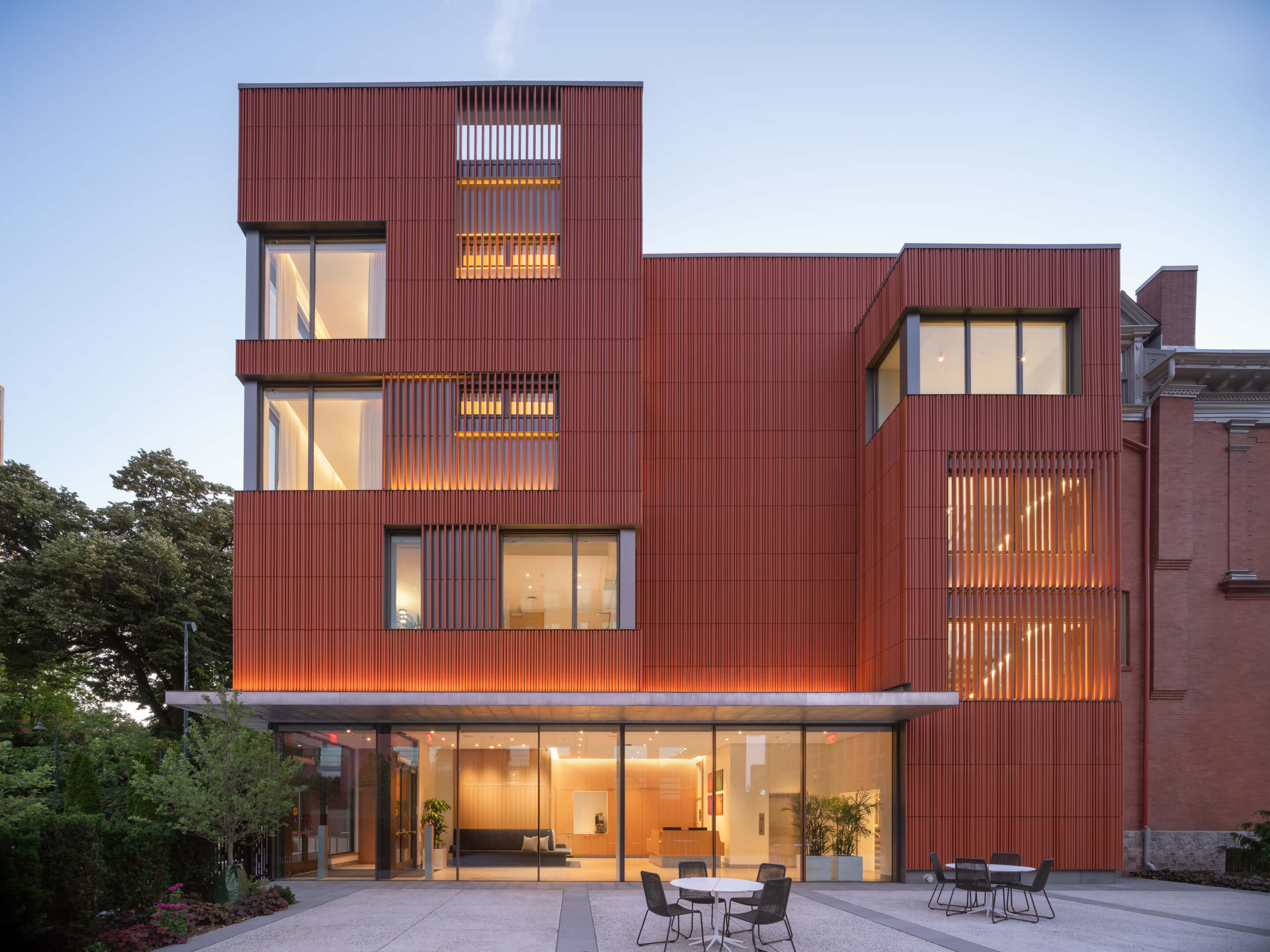
University of Pennsylvania Meeting & Guesthouse
Deborah Berke Partners
Philadelphia
Deborah Berke Partners’ Meeting & Guesthouse brought a baguetted terra-cotta facade to the University of Pennsylvania’s historic campus. Designed as an addition to two existing Victorian townhouses. The townhouses were in need of significant work, requiring masonry repair, and work on facade details “ranging from plaster, to sheet metal, to carved wood,” Deborah Berke Partners partner Stephan Brockman told AN. The addition is clad entirely in terra-cotta, save for the doors and windows, with a color that reflects the brick of the townhouses without attempting to mimic them. The design team paid close attention to how light played off of the terra-cotta, staying true to the early-stage concept of a light-veiled form that had been shaping the building’s design.

The Castle
Angelo Candalepas and Associates
Sydney
Shaped by concrete apses and arches, Angelo Candalepas and Associates’ 37-story tower in Sydney was inspired by its surrounding neighborhood. Named ‘The Castle’, the tower is formed by a 10-story podium, home to a hotel, and extending residential tower, which cantilevers over an adjacent heritage building. The uppermost five stories of the tower are set back in accordance with the city’s solar access height plane regulations near Hyde Park, and contain stepped gardens. The facade of the residential tower was constructed with arched and flat precast concrete elements, while the facade of the podium was constructed with curved, in-situ concrete slab edge ribbons.
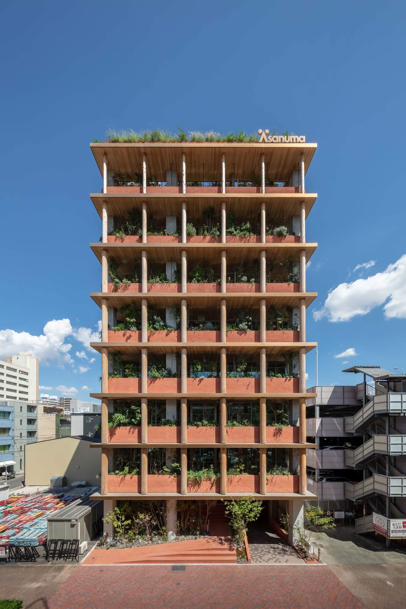
Good Cycle Building 001
Nori Architects
Aichi, Japan
Nori Architects’ renovation of the Asanuma Corporation’s Nagoya Branch Office was completed with an extensive use of recycled materials. Nori Architects was tasked with opening-up the facade of the 8-story office building, originally built in the 1990s. On the first two floors, the east-to-west slabs were taken out to create space for a stairwell. Moving up the building, on the office floors, existing windows were set back, eaves were installed, and interior programming was arranged around the core to optimize daylighting and natural ventilation in workspaces. An addition on the street-facing facade was constructed with earth-plastered walls and logs, emphasizing the intent of designing a building with natural materials.


