AN Interior’s inaugural top 50 interior architect list featured emerging and established firms across the U.S. The editors surveyed the Top 50 highlighted in the March issue and asked them to reveal their favorite building materials and products. The list below entails what made the cut.
To honor them, the editors of The Architect’s Newspaper and AN Interior will celebrate 2018’s leading design minds in New York’s A&D Building. You can meet the acclaimed architects and AN’s editors inside over 20 participating showrooms, this Thursday, March 8. Architects and designers alike can register to attend here.
Toshiko Mori
Principal, Toshiko Mori Architect
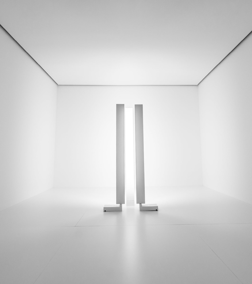
“By designing sheet lights instead of bulbs, Kaneka OLED creates products that emit light evenly, softly, and with excellent color rendition—close to natural light. The LUCE Rotatable Floor Light’s ability to move allows for the creation of different atmospheres. The ambient glow is also bright enough for reading.”
Leonidas Trampoukis and Eleni Petaloti
Founders, LOT
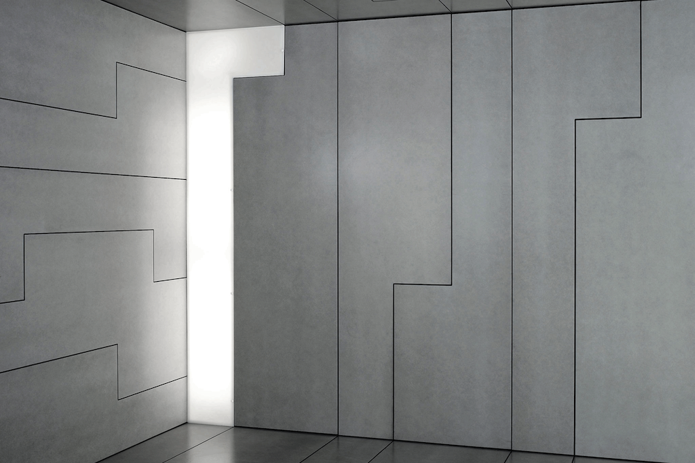
“We needed a lightweight product to renovate an existing facade on a townhouse in Brooklyn that could be more than just paint, but also an extension of the interior materiality. We were amazed by the texture, availability, duration, fast installation, and clarity of Equitone fiber cement panels.”
Stephanie Wexler
Interior Designer, archimania
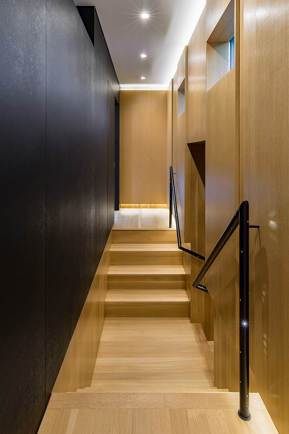
“One of our favorite building materials is Richlite, a composite panel material made from post-consumer recycled paper. We recently used it as a wall and door material for renovations to the attic of the Tobias Residence, a home on the historic register. We envisioned a modern material that amplified the contrast between old and new construction, as well as something structurally sound that offered color all the way through and had finished edges. Once the product was coated with a sealer, the material produced an enhanced tactile quality that reflected natural light throughout the day.”
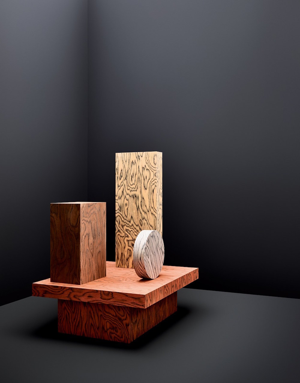
Benjamin Aranda
Principal, Aranda\Lasch
“Technically sophisticated and visually shocking, the ALPI Lignum Wood Laminate by Ettore Sottsass is still, years later, so much fun to use.”
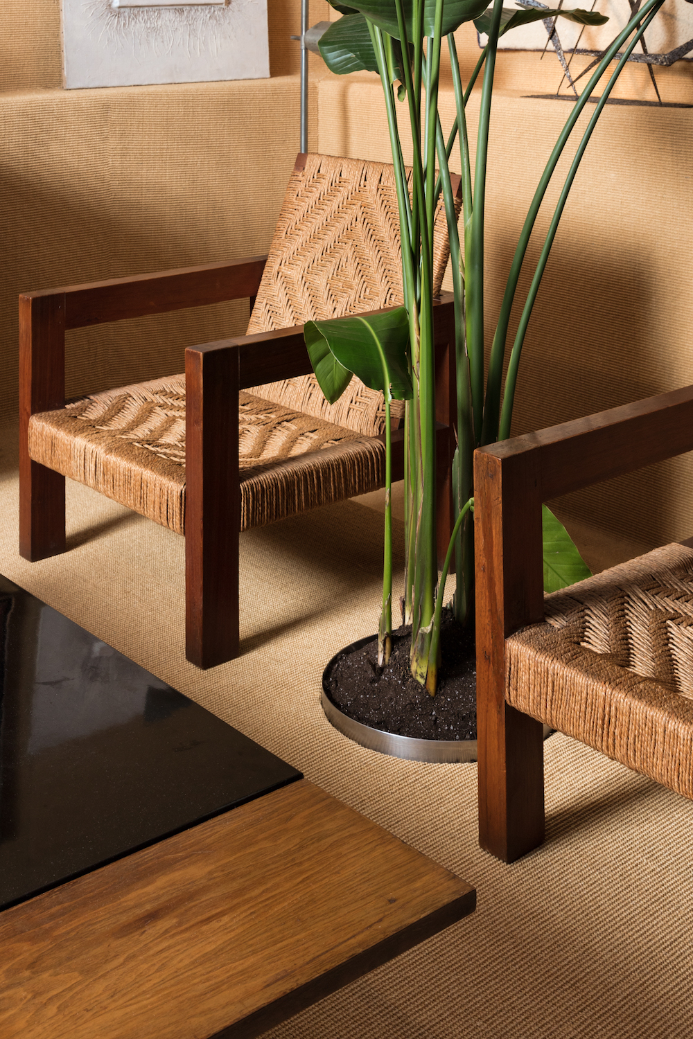
Andre Herrero
Principal, Charlap Hyman Herrero
“Sisal is a stiff fiber made from an agave plant of the same name, most commonly used to make rope or twine, but also found in fabrics, rugs, and wall coverings. For us, sisal is a subtle yet compelling material in interiors, lending a natural, summery feel to a given space. In a booth for Patrick Parrish Gallery at the Salon Art + Design fair, we covered both the floors and the walls with it for complete effect. Sisal has a way of visually situating the works of art and furniture; it supports them and gives them a warm backdrop.”
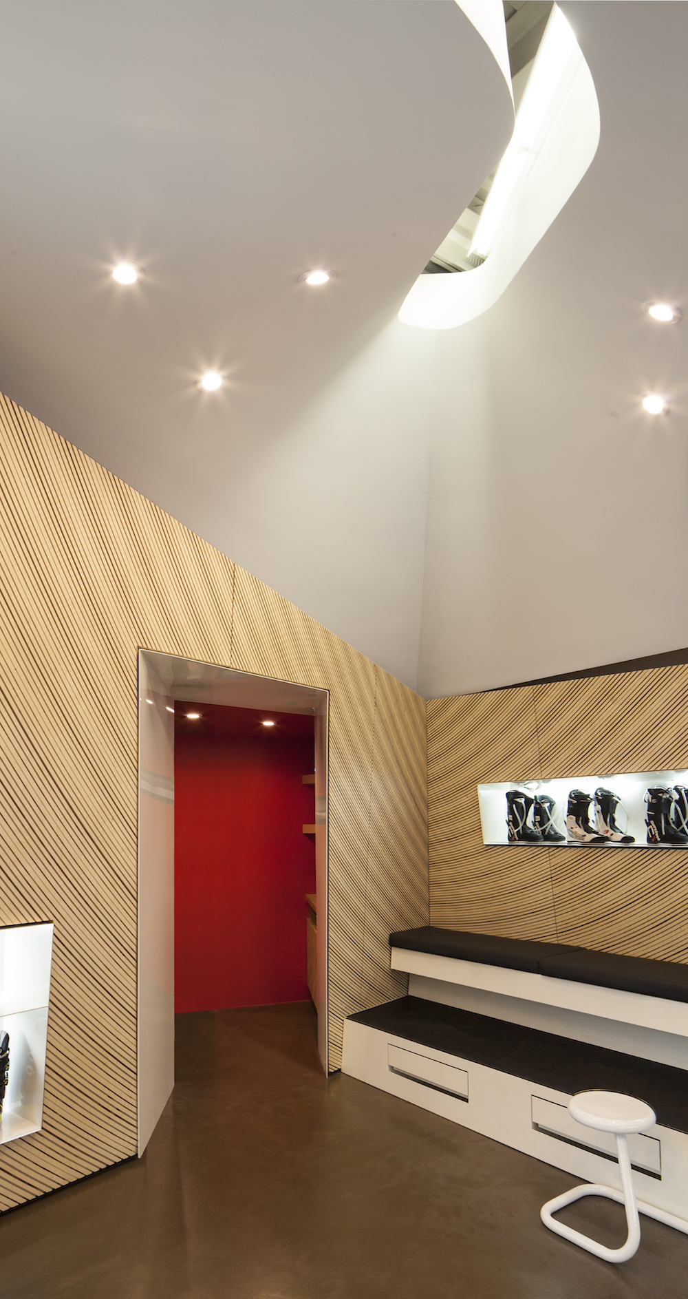
Andrew Holder
Co-Principal, LADG
“Plywood is a beautiful product because it embodies so many contradictions. It can appear to be very refined and highbrow, but at the same time it is a ubiquitous component used in the roughest kind of ad hoc construction. The exterior surface is monolithic and continuous, but the cross section at the edge is exactly the opposite—clearly made of many trees in thin slices all oriented in different directions. It has the appearance of being effortless and low-cost, but is in fact a very difficult material with finicky tolerances, especially as you approach the limits of bending or machining it at a small scale. The big stacks of sheets at the lumberyard look like they are already buildings.”
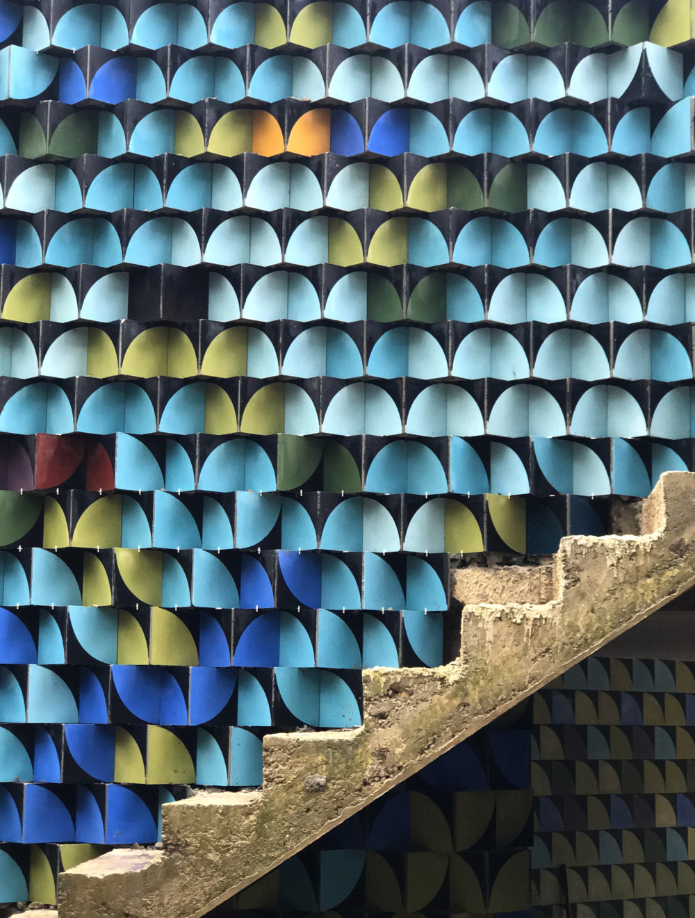
Bryan Young
Principal, Young Projects
“We have worked with encaustic cement tiles in multiple scenarios, but recently have found success making custom colors and patterns through a partnership with a fabricator in the Dominican Republic. Locally, these tiles are very common and therefore are an economical selection for a custom finish. On our Playa Grande Retreat project, we created a custom pattern and color palettes for the bathroom floors throughout the building. More interestingly, we applied a different selection of tiles to clad the exterior facades of the Glitch House. The tiles create a shifting graphic pattern that visually reverberates with the physical geometry of the pixelated concrete block walls to create some really interesting optical effects.”
David Darling
Founder, Aidlin Darling Design
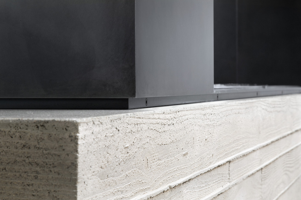
“In the Bay Area, we are fortunate to have a handful of incredible ornamental metal fabricators that coax life out of seemingly innocuous metals. A favorite of ours is cold-rolled steel plate with a blackened patina. A great metal finisher can bring a subtlety and warmth out of this traditionally utilitarian material, affording us the ability to use it in more intimate, as well as communal spaces.”
Clive Wilkinson
President, Clive Wilkinson Architects
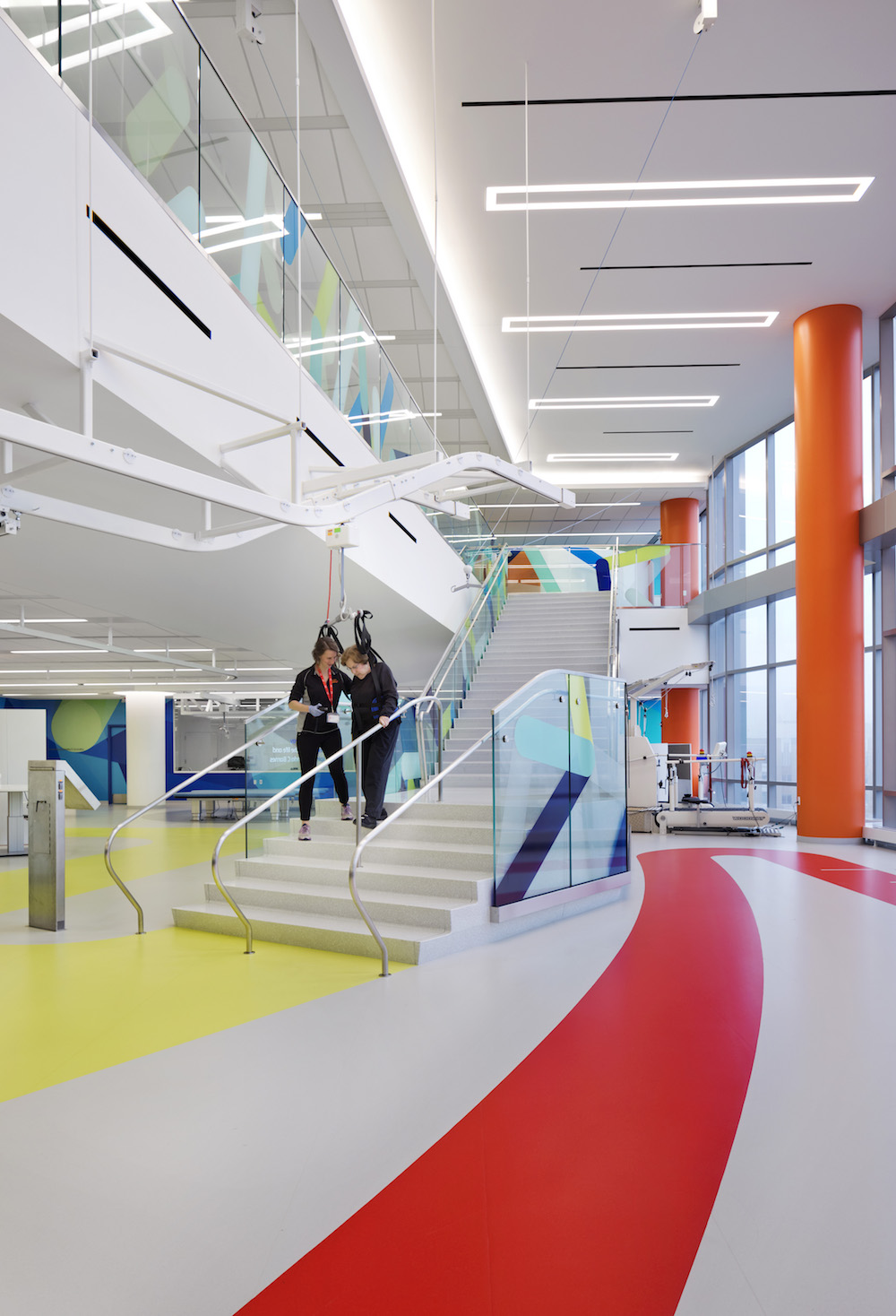
“We often use rubber flooring on our projects for circulation and amenity spaces due to its excellent durability and sustainability. It’s also very comfortable and quiet underfoot. For the Shirley Ryan AbilityLab, we worked with nora systems’ rubber to develop custom colors, which are much more saturated than the company’s standard offering. The bright, bold colors bring an incredible amount of energy into the labs and really encourage the patients to get up and move.”
Brian Johnsen
Principal, Johnsen Schmaling Architects
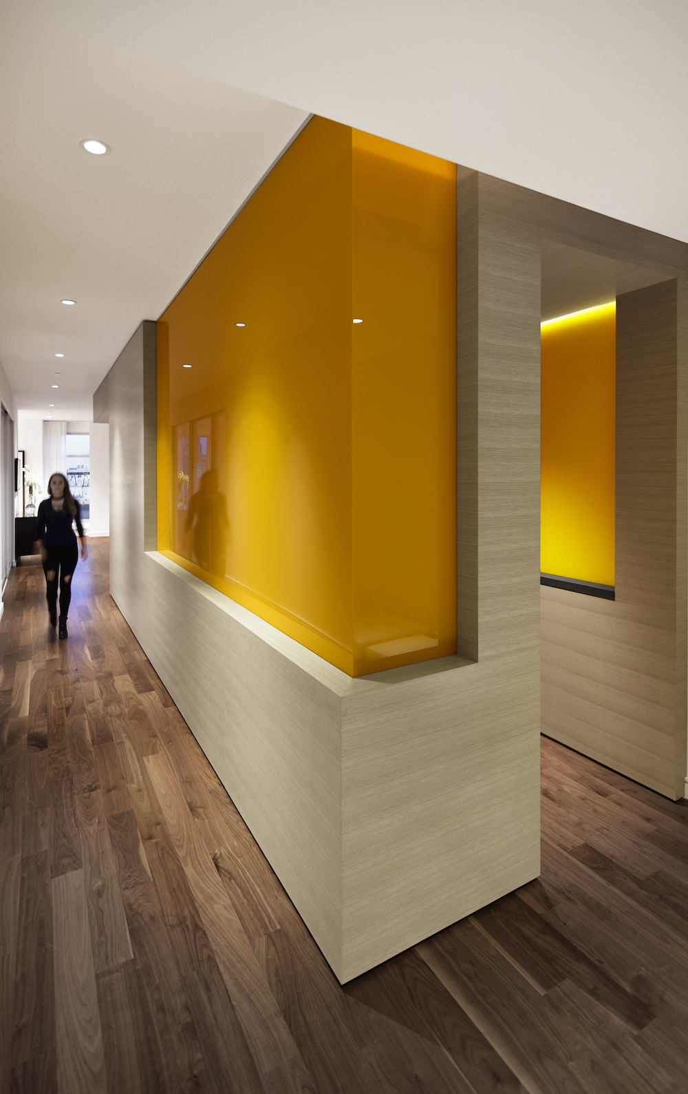
“Much of our interior work exploits the tactility and inherent textures of wood, concrete, and stone. We often use sheets of back-painted glass as an aesthetic counterpoint, one that contrasts the haptic qualities of these materials with a perfectly smooth, highly reflective finish. To avoid the green tint of regular float glass, we usually specify low-iron glass, which allows us to achieve the exact chromatic hue to complement the overall interior palette. Large sheets eliminate visible joints, further enhancing the appearance of immaterial perfection.”
Rafael de Cárdenas
Founder, Architecture at Large
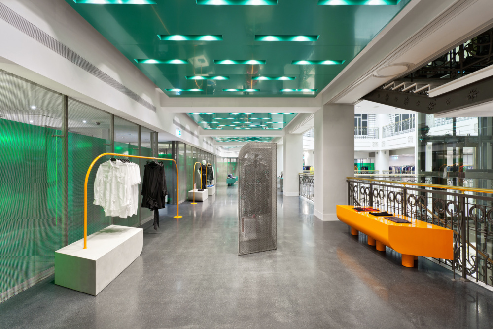
“When working with hard surfaces, anodized aluminum is our preferred treatment for adding a saturated color. It has the ability to create a sense of refinement and contemporaneity, here, on the ceiling of Au Pont Rouge department store, it enhances other unusual materials and colors in the space.”
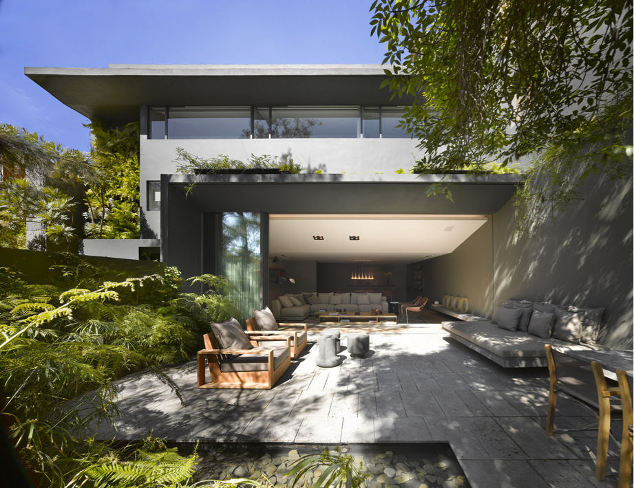
Ezequiel Farca and Cristina Grappin
Founder and partner, Ezequiel Farca + Cristina Grappin
“Recinto stone is a volcanic stone of great hardness, different types of porosity, and a special tradition in the colonial architecture of Mexico. We use recinto stone because it adapts to the chromatic and textural palette used in the studio. The material has allowed us to apply it in floors and walls, and consolidate objects of our own design. It achieves interesting finishes depending on its use, from honed surface for terraces and outdoor furniture to polished gloss for design objects, or natural finish in innovative pieces that celebrate the aesthetics of the raw element.”
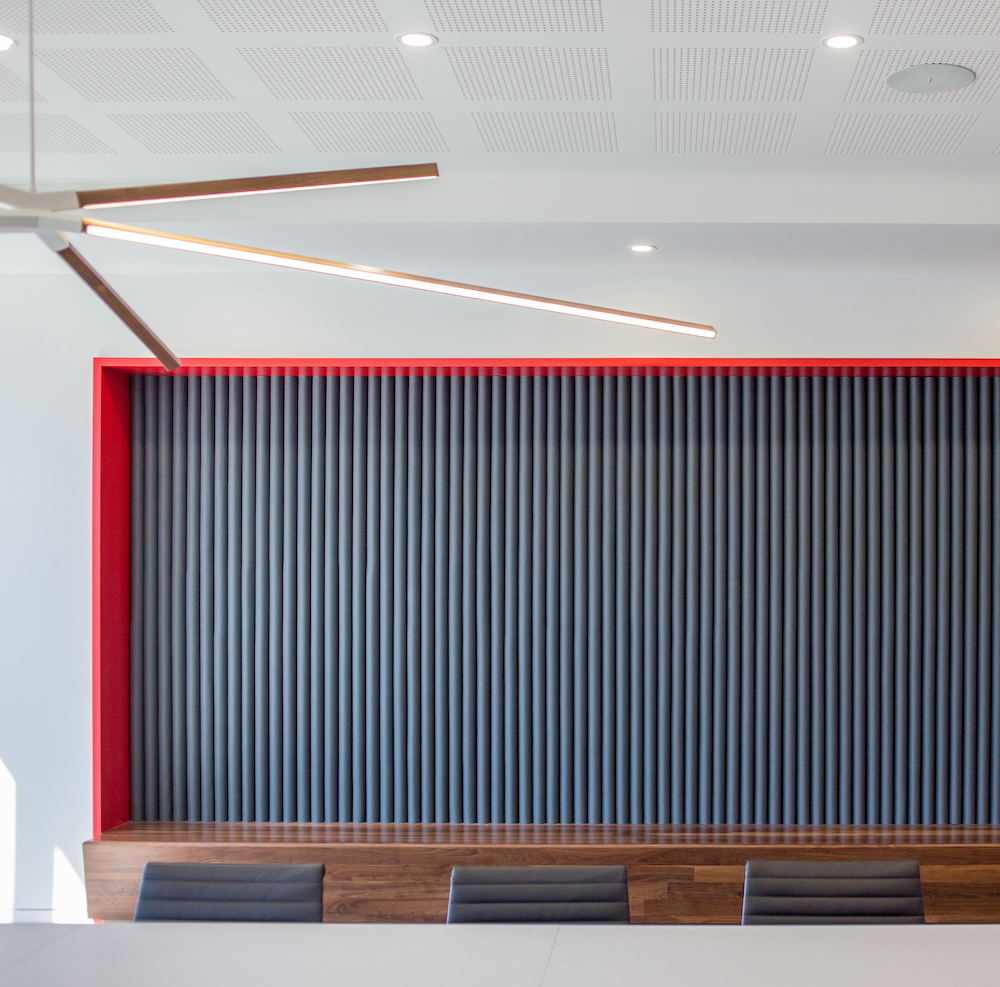
Mark and Amy Leveno
Principals, OFFICIAL
“We like Filzfelt because of its quality and well-curated colors. For the Civitas Capital Group headquarters in Dallas, we used the Filzfelt ARO Plank system in the conference room niches both for sound absorption and as a backrest for the integrated bench. The deep grooves of the plank system added texture to assist in visually breaking up a large space.”
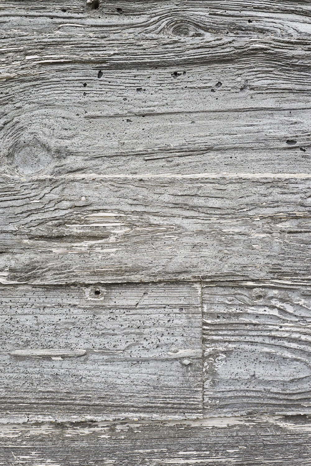
Aaron Schiller
Principal, Schiller Projects
“In the Chilmark project, I collaborated with the principals of Gray Organschi Architecture. We were very interested in utilizing the structural walls of the house and the retaining walls of the property to express the nature of the rural ecology, slicing into the landscape itself. To that end, we went to Pennsylvania and bought a huge amount of throwaway wood used in large-scale farming. The wood appears extremely weathered due to the nature of the enzymes that leak into the boards during the farming processes. We upcycled this stock, milled it into usable formwork. I was on-site assisting in the carpentry and overseeing the proper layouts for weeks at a time. When the lining finally came off the wood, it revealed this deeply embedded graining and wood patterning on the face of the concrete. It was as if we were able to freeze the exposed landscape and use it as part of our building process.”
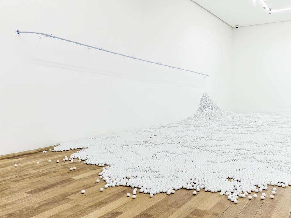
Alex Mustonen
Partner and cofounder, Snarkitecture
“We’re interested in the idea of a sphere as an architectural material to infill a space. The glass marble sphere is inherently playful and can be unpredictable in its movement.”
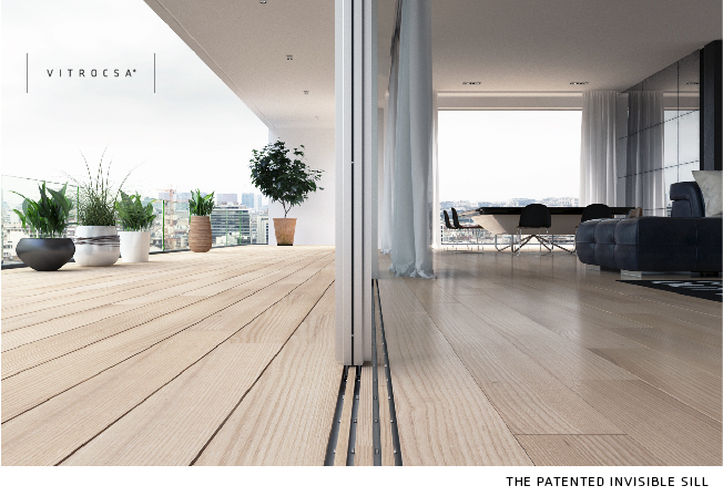
Conceal the tracks of the Vitrocsa minimal sliders and create a beautiful seamless floor transition from the inside out.


