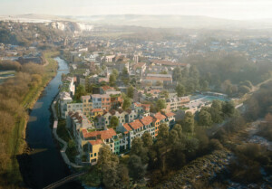
Milton Keynes: Britain’s youngest, technically unofficial, “city” has a habit of making headlines for all the wrong reasons—routinely being laughed at for having fields populated with concrete cows and being a mecca for roundabouts.
Yet the New Town was regarded with its grid road system as the avant-garde of planning upon its birth in 1968. Heroic ambitions cast aside, it has since been derided for embodying all the faults of top-down planning and for later becoming a developer-friendly business park.

In 1999, a new cultural establishment, the MK Gallery, opened on the edges of Midsummer Boulevard, but it was never quite able to latch onto the spirit of a new Millennium. Milton Keynesians’ search for something new to shout about went on.
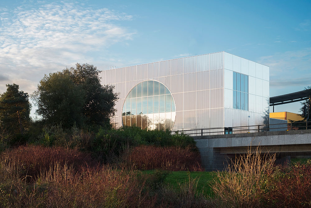
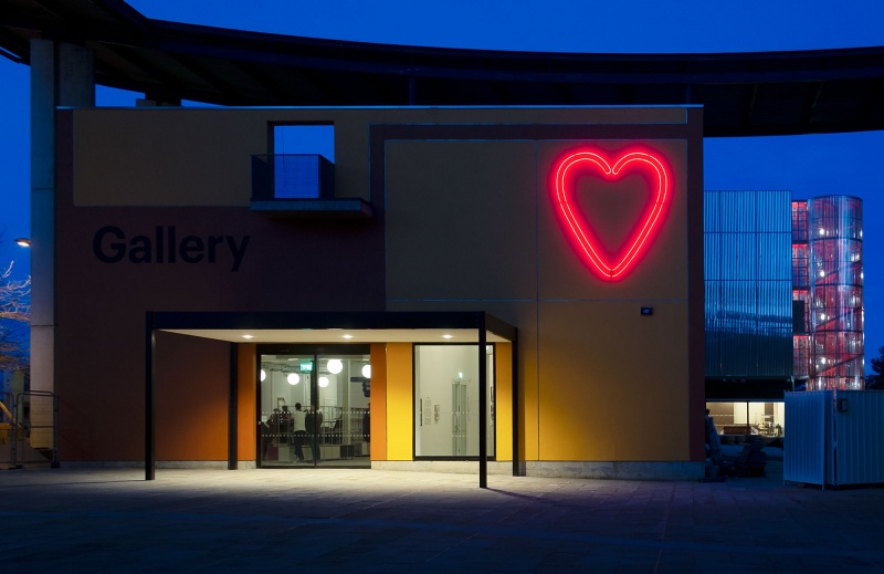
And so arrives the extension and re-jig of the MK Gallery from British architects, 6a. It’s a box, much like most of the area’s buildings, but the gallery’s glimmering facade emerging from the surrounding greenery hints at something much more tantalizing.
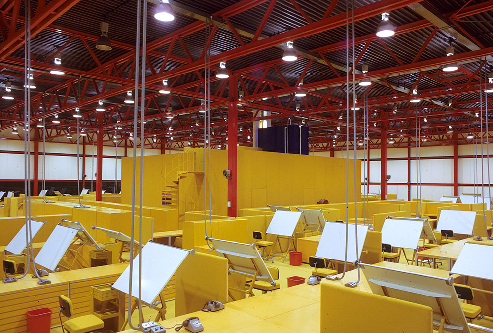
“We wanted to make a building that was utterly Milton Keynesian,” Tom Emerson, founding director of 6a architects, told The Architect’s Newspaper. “The prototypical building of Milton Keynes—from the shopping center to the [Milton Keynes Development Corporation] design offices—is the steel frame shed and its variations.”
6a employed polished steel to clad the new structure, folding it incrementally to reflect literally and metaphorically Milton Keynes’s grid plan. “Sometimes it kind of radiates light and color from the most unlikely sources. It is very much alive and dynamic,” added Emerson.
Already the gallery has been nicknamed the “tumble dryer” by locals—such is the British predilection for giving new buildings colloquial monikers. The gallery hasn’t even opened yet, but the nickname suggests residents are warming to it already, eager to embrace it as an MK building. The nickname derives from a circular motif in the facade, which has been split horizontally to form a giant, semi-circular window. “The circle is the most explicit form used in the design of Campbell Park, which the gallery overlooks. There are circles and cones everywhere,” said Emerson. “As the gallery is the last building along Midsummer Boulevard, we wanted to make it a simple meeting of the two forms; the grid of the city meets the circle in the landscape.”
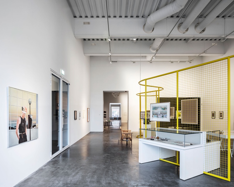
Retaining the original structure, the architects have more than doubled the gallery’s initial size. Inside this becomes apparent through five new double-height galleries, the first reaching 30 feet high, the rest 20 feet, all coming together to provide more than 5,300 square feet of exhibition space.
The new, re-energized MK Gallery, however, posits itself as more than just a space for hanging art. A new auditorium, known as the “Sky Room” will offer views over Campbell Park and double-up as an independent cinema. A new foyer, café, and garden have also been added.
“The aim of the new gallery is essentially to appeal to a larger and wider audience,” Emerson explained. “We realigned all the openings of the old gallery with the new ones in a continuous ‘enfilade.’ The long axis through the building (with windows to the outside on either end) reflects within the building the spatial structure of the city itself.”
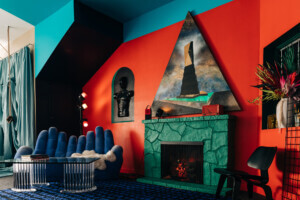
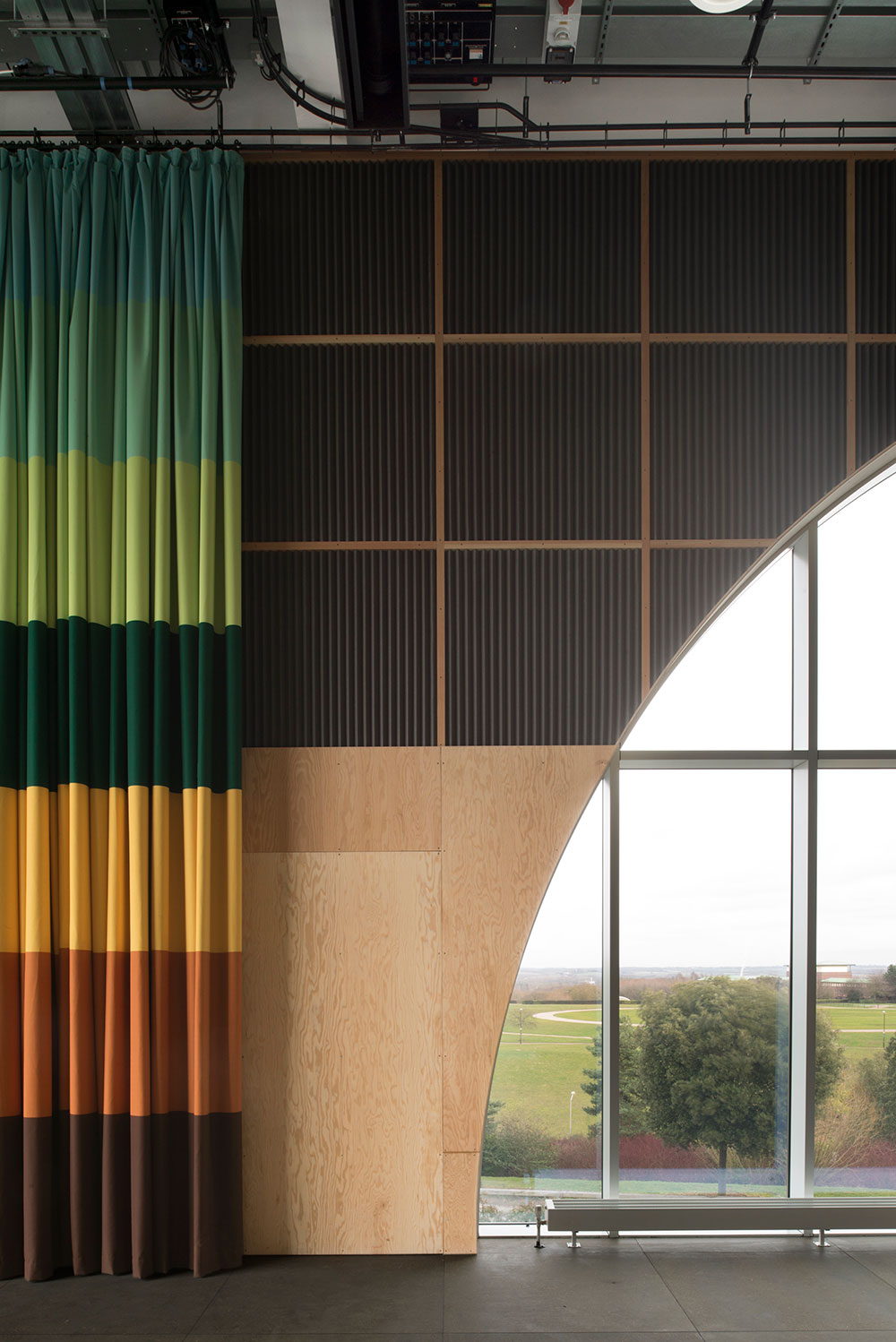
While it shimmers externally, inside, MK Gallery plunges visitors 30 years into the past with a color palette from a 1978 Habitat catalog. This is all thanks to artists Gareth Jones and Nils Norman, who worked with 6a on the scheme. It’s a bold move but one that emphatically pays off.
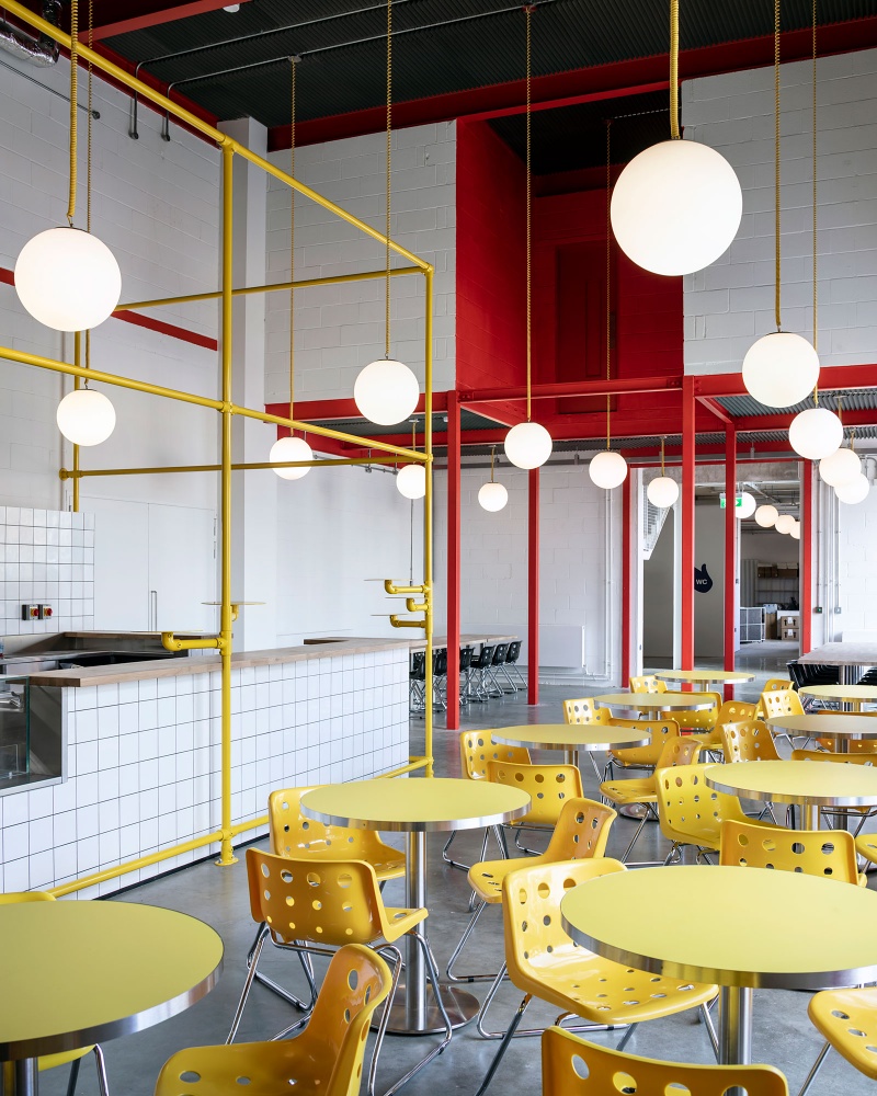
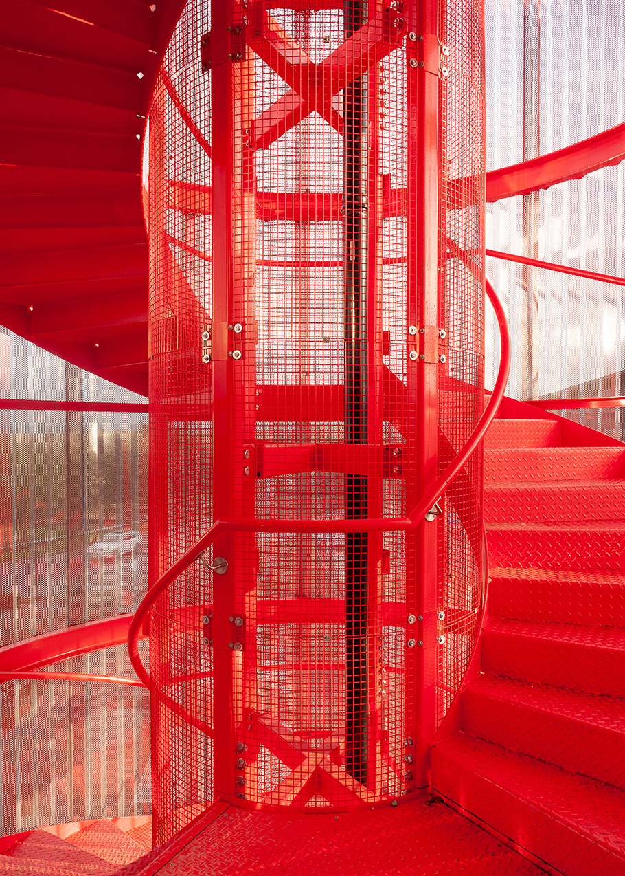
Bands of greens, yellow, and browns form a lavish curtain lining, which partially engulfs the plywood-clad Sky Room; a fire escape spiral staircase has been painted bright red; internal stairs are yellow—minus the cigarette smoke stains from the ‘70s; bathrooms have been doused with maroon, brown, and emerald; and the white-walled café features a happy menagerie of hanging light spheres, red beams, yellow chairs, and pipework—a literal throwback to Milton Keynes’s now-defunct architecture department, once nicknamed the “Custard Factory” due to Norman Foster’s design.
Nostalgic recollections of the past can often be saccharine, but not here. MK Gallery is an example of how to work with the recent past, celebrating it visually and marrying it with an exciting program, all of which has been packed into an architecture that reflects Milton Keynes today, while also priming it for tomorrow.
MK Gallery opens to the public on Saturday, March 16.