Traditionally, the one-liner is derided in architecture as something crude, unsophisticated, and anti-intellectual. It gets abuse from all angles, from conceptually-minded curators, traditional architecture critics, and even virtuosic architects who prefer “multiple readings” of objects, or “difficult wholes.” It seems the one-liner is the most isolated and hated syntactic metaphor in the architect’s tool bag; the last frontier of architectural bad taste. Even Patrik Schumacher complained on Facebook about the National Pavilions. “”Pavilions were…given over to one-liner installations, which could be absorbed by stepping in and out for 30 seconds.”
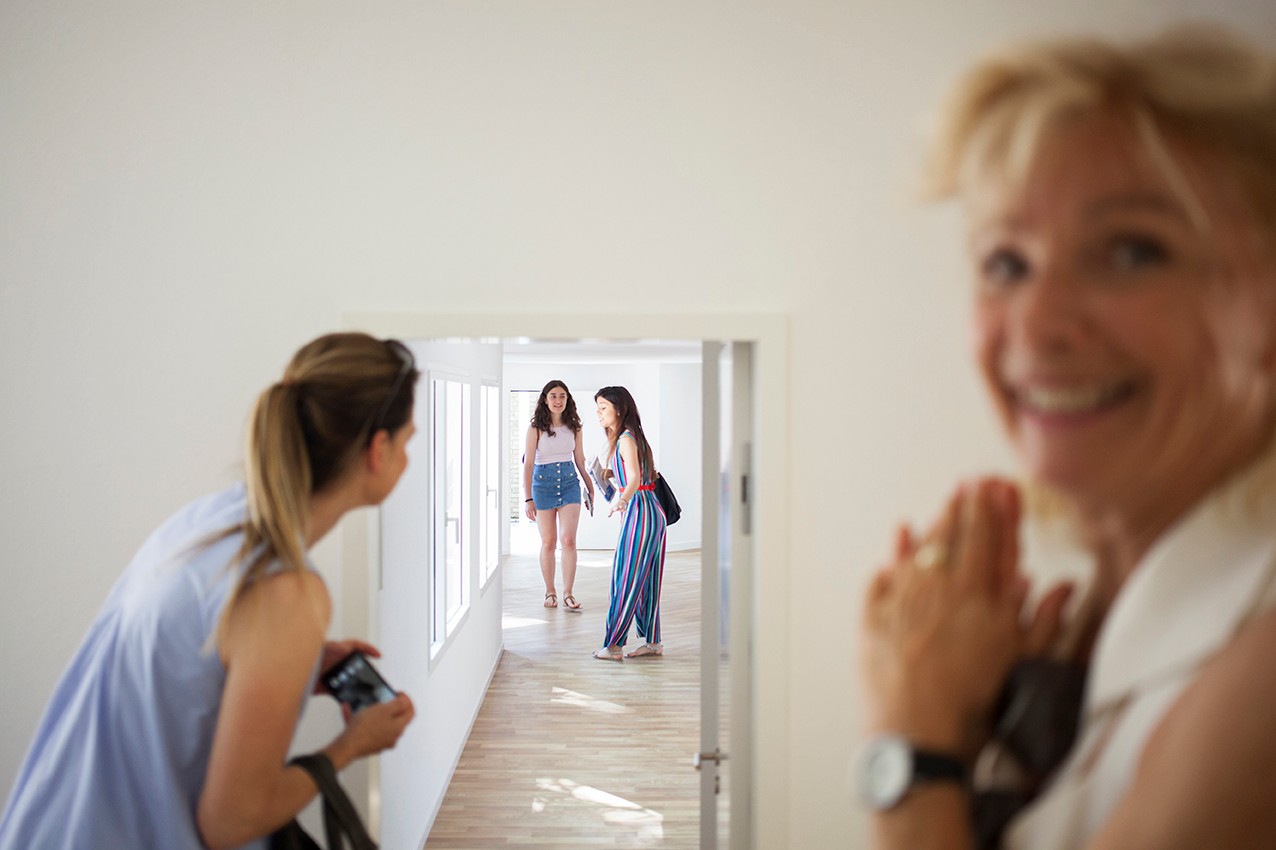
However, one-liners finally got their due at the 16th Venice Architecture Biennale, where simpler, conceptual installations took home the Golden Lion of National Participation as well as the special mention in the same category. The Swiss Pavilion, “Svizzera 240: House Tour” was a delightful funhouse where the everyday elements—doors, windows, handles, and kitchen appliances—of a typical new apartment were exaggerated to be too small and too big, creating a disorienting space that explored the banality of contemporary residential construction and the distortions of scale that are caused by photography in the real estate industry.
It was a one-liner that executed one concept well enough to provoke not only happy visitors, but also allowed personal reflection on whatever the topic at hand. The actual pavilion avoided over-complication (which plagued many of the national pavilions), and provided a “freespace” for contemplation and reflection. Because after all, even the simplest pavilion cannot be fully understood in every single aspect, and the most complicated book-on-the-wall exhibition can’t fully explain anything anyway, even if you took the biennale’s full six months to read it all.
The winning pavilions avoided many of the problems faced by some of the other national participants.
First, there is an increasing trend of pavilions getting overrun by curators who want to foreground curatorial practice pyrotechnics over smart delivery of content, obscuring the point of the exhibition. The one-liner doesn’t do this. Secondly, some pavilions looked to appropriate the headlines and buzzwords of the day, delivering incoherent and scattered exhibitions that paradoxically make arguments against the possibility of freespace today. And thirdly, the one-liners actually provide respite from the book-on-the-wall urbanism exhibitions, which ended up falling flat.
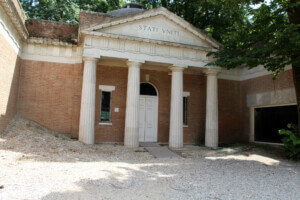
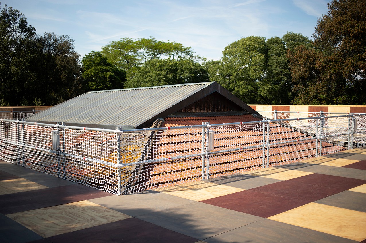
One-liners, like deadpan humor, often do not have punchlines, and leave an open-ended silence at the end of the joke, as is the case for the special mention–winning British Pavilion, “Island,” where Caruso St. John emptied the pavilion out and constructed a large plinth over the top. It is unclear what the point was, but the effects were spectacular, lifting the user over the Giardini, causing a certain estrangement from the Biennale itself, and forging a connection with the city beyond.
Of course, one-liners always hint at more. They are short and seem simple, but with a little thought, can reveal the layers beneath, like a good Rodney Dangerfield or Norm Macdonald joke. Both the Swiss and British installations rearranged bodies in particular ways, which gave them not only multiple interpretations, but highly individualized experiences that could be taken with layers of meaning.
One-liners are funnier than zero-liners. And one-liners can avoid many of the pitfalls of 15-liners, which end up being zero-liners anyway. The Belgian pavilion, “Eurotopie,” also stood out as a one-liner: a simple concentric series of blue circles created a forum of sorts in the building; as did the Nordic, which simply featured inflatable sculptures.
Instead of over-complicating things with over-curation, the one-liners produced this “freespace,” allowing the visitor to become part of the exhibition, but without sacrificing intellectual rigor or content.