
Designing for friends has its advantages. More trusting than an anonymous client, a friend will often let you get away with a lot when it comes to pushing creative boundaries. This was the case when Sean Griffiths started work on the Hearn Hill House in South London. Griffiths, head of London-based Modern Architect, and once a member of the now-disbanded FAT, has been taking such opportunities to work out what exactly it means to run a post-FAT firm—experimenting with color, geometry, materials, and illusion.

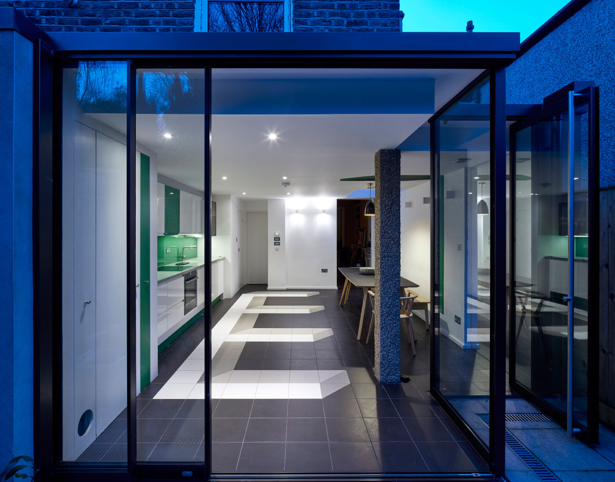
Despite its limited scope—a small ground-floor kitchen expansion—the project immediately faced strict building restrictions due to its location in a conservation area. The area’s restrictive code prevented the addition from wrapping around the rear to the side of the building, but did allow for extensions out from both faces separately. Rather than fighting this condition, Griffiths opted to take the code quite literally and make two glazed extensions, achieving needed natural lighting, maximizing floor space, and exploring some spatial ideas.
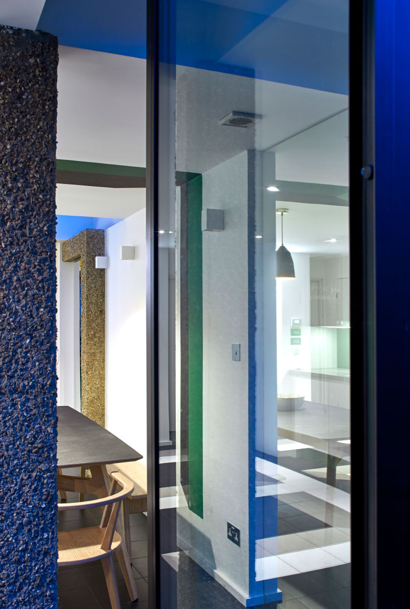
“With this project I was aiming at a kind of realism. That partly has to do with the way planning constraints shape a project like this; there are certain structural issues and a sense of materiality,” explained Griffiths. “So in the first instance, the plan is almost completely (and absurdly) determined by planning rules. This led to structural and spatial issues that resulted in the odd placement of the column (which also made it interesting) and the use of mirrors to resolve the spatial problems in the largely predetermined plan.”
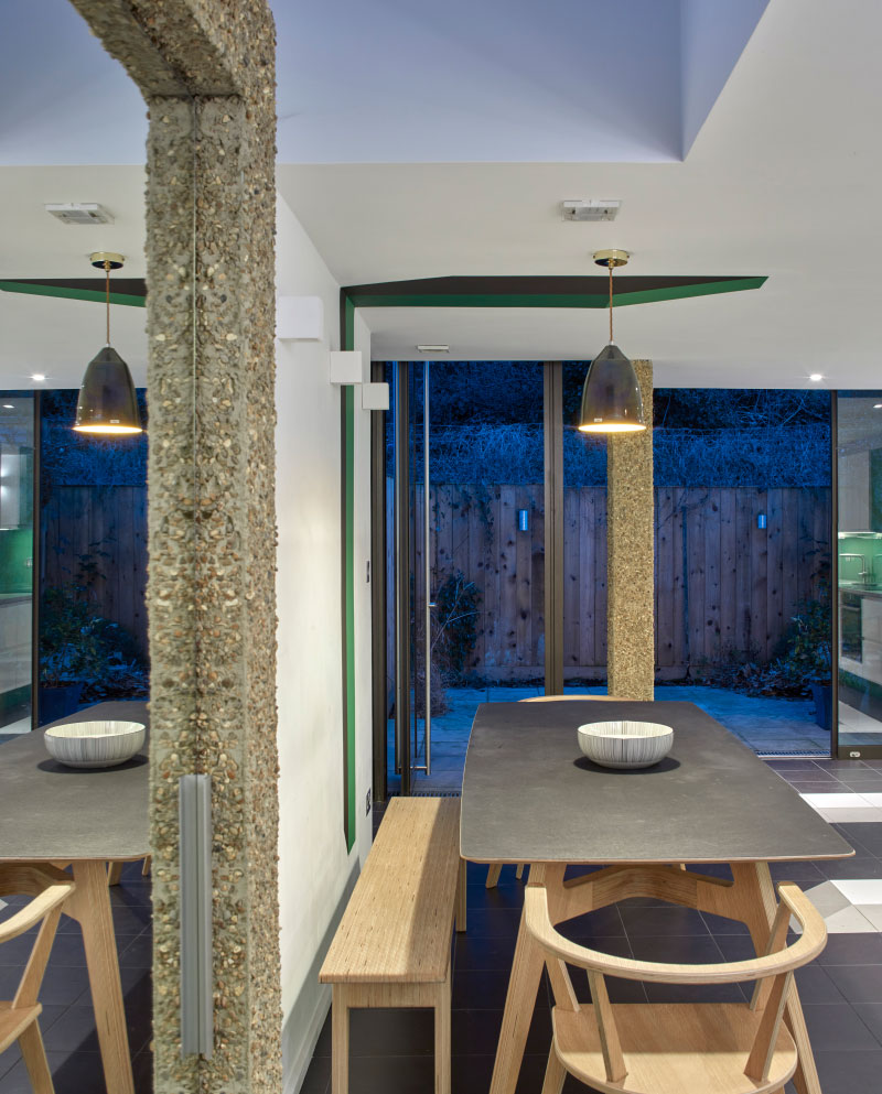
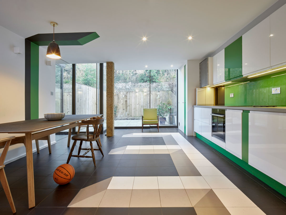
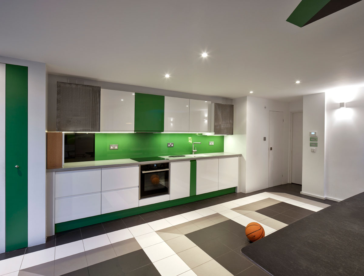
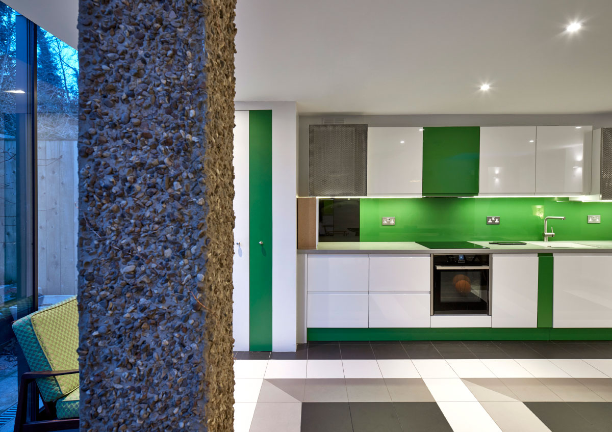
In order to rationalize the kitchen’s new, slightly awkward footprint, Griffiths deployed a number material and graphic techniques. Drawing on a time-honored trick, two floor-to-ceiling mirrors double the perceived size and brightness of the room. The mirrors also produce a visual symmetry, negating the effect of the code-determined floor plan. Columns in the space are pebble-dashed, a nod to Brutalism, as well as the facade of next-door neighbor’s home, visible from the space.
“The client wanted something Brutalist, but we couldn’t afford that so we pebble-dashed the column. In the UK this is thought of as a tacky finish that poor people with no taste apply to their houses and that middle-class people spend a lot of money on having removed when they buy houses covered in it.”
With limited budget and space, color and pattern would have a significant impact on the project. Undeniably, the most striking feature of the room are two large designs painted on the floor, wall, and ceiling. Continuing the geometric motif of the columns, these graphics produce a forced perspective, which once again challenges the shape and size of the room. Distorted from all but one angle, when the viewer is properly positioned the shapes snap into perspectival alignment, appearing to be 3-D. For color, a rich green and a series of grays were pulled from Andreas Gursky’s photograph Rhein II, which is one of the most expensive photographs ever sold, and a favorite of the clients.
With the Hearn Hill House addition, Griffiths takes the project’s challenges, legal limits, and limited budget, and turns them to his advantage. A play on representation and reality, flatness and form, the space realizes ideas far beyond its humble programming.