How does one do good work for bad people? This oversimplified question is especially relevant for architects, and one that the exhibition of work by East German graphic designer Klaus Wittkugel at P! Gallery (P! Gallery, 334 Broome St., New York. January 14–February 21, 2016) asks us to consider, while simultaneously treating us to some modernist visual pleasure.
Since the fall of the Berlin Wall, we have been taught that capitalism is the end-all-be-all system to structure our society, and consumption is the answer to our desires—overwhelmingly influencing our aesthetics and our ethics. But looking at the oeuvre of the little-known figure Wittkugel, who was the head designer of the German Democratic Republic’s Socialist Ministry of Information, we find an alternate reality: A sense of aesthetic purpose that, while firmly modernist, shows a softer, more figurative and less abstract approach to design. And yet at times it can be reminiscent of Socialist Realism propaganda, which today is usually met with finger wagging and dismissed as kitsch. It is supposedly the preferred visual language of dictators, with smiles beaming sunshine and 150 percent worker productivity embodied in a visual image. Yet what Ost Und oder West [East and West] reveals is a more complex relationship between design and power, and the limits of artistic freedom under Soviet Communism in post-war Germany.
The exhibition is not only impressive for the work it contains, but also for how it was assembled. P! founder and director Prem Krishnamurthy spent more than seven years assembling Wittkugel’s work into a thorough survey of books, posters, exhibitions, and signage, found in auspicious moments at used bookstores and by scouring eBay. In the process of uncovering this history, Krishnamurthy tells of an early encounter in Wittkugel’s career in 1950, when he designed a poster for a GDR Five Year Plan, and was chastised for its abstraction. Some higher party official determined that this abstraction did not adequately service the proletariat. Witttkugel was censured for not being a good enough Communist, and subsequently forced to attend remedial Socialism classes, brushing up on his Marx and Lenin as if that would instill his graphic designs with the proper message.
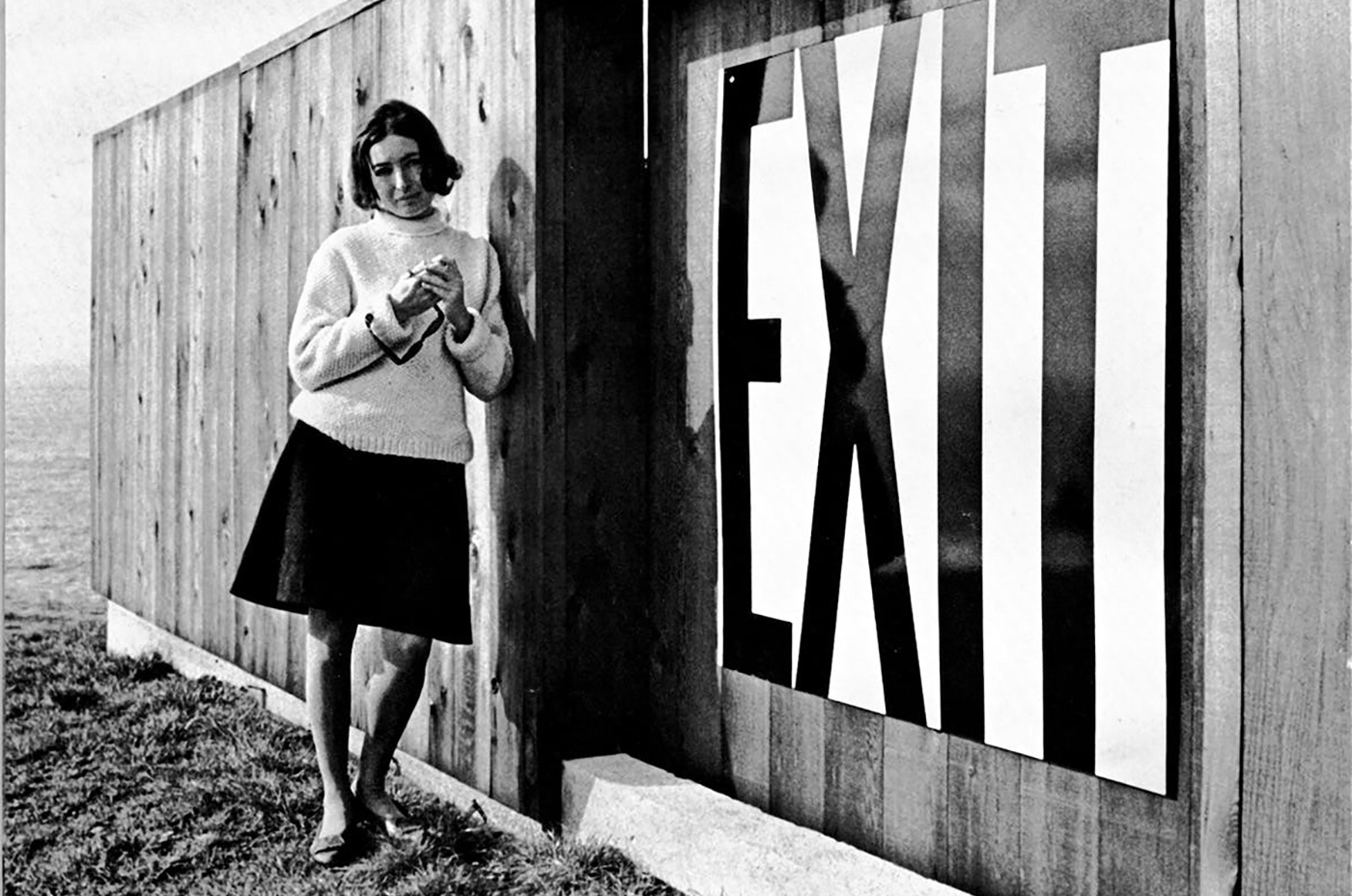
The work of Wittkugel displayed in the gallery is in a visual style that positions him as an heir to the legacies of early 20th-century design legends El Lissitzky and László Moholy-Nagy, like a long-lost East German cousin of the earlier German Bauhaus and Russian Constructivist diasporas. The judicious use of mise en abyme—the graphic technique of creating an infinity mirror, a recursive visual trick where an image contains a smaller version of itself in a window in a window in a window, etc…. We might describe this today as “meta.” Krishnamurthy acknowledges that one of the things that really attracted him to his work is “a strain of self-reflexivity about the production of graphic design. So you have a poster, for an exhibition of posters, that is a freshly-postered poster column,” he said. The P! exhibition continues this game by recreating the poster column on the gallery facade.
All of this is juxtaposed with a companion exhibition at OSMOS gallery on the work of Anton Stankowski, a former classmate of Wittkugel’s from the Folkwang University of the Arts, who went on to work in West Germany and Zurich, designing many corporate logos—most notably the minimal Deutsche Bank slash-in-square, which is still in use today. While Stankowski designed symbols of Western businesses and corporations in service of capital, Wittkugel designed the visual manifestation of the political and cultural ambitions of Soviet East Germany in the form of dinnerware, an elegantly embellished cursive visual identity, and signage for the now-demolished Palast der Republik.
While works like Wittkugel’s signage for the Kino International relate more directly to architecture, the exhibition offers conceptual lessons for architectural practice about architecture’s inevitable collaborations with people whose values may not align with one’s own. You can refrain from designing prisons if you object to incarceration, but it doesn’t mean some architect somewhere won’t design that prison, so why not engage and attempt to design a more humane prison?
The importance of critical engagement is shown in Wittkugel’s 1957 exhibition Militarism without Masks. He conceived of the exhibition, organized the team, designed it with his students, and ultimately won the East German National Prize. It was a polemical, anti-West German exhibition that featured former Nazis who became part of the West German government, juxtaposing images of Hitler with Henry Ford, snakes, and gold coins. The show featured two levels of narrative: Detailed vitrine presentations with archival materials that told the story of the Krupp family and how they made money from the war, alongside big bombastic moves that allude to El Lissitzky’s exhibition designs. Another impressive element was a mechanically louvered sign with vertical, rotating triangular slats to display three images. Also included in the exhibition was a panorama of the Kurfürstendamm in West Berlin, portrayed as a wasteland without humans—a newspaper kiosk with militaristic posters on it stands alone. Four years later, in 1961, when Wittkugel did his own retrospective exhibition, he recreated that same newspaper kiosk in the photograph, at a one-to-one scale, thereby showing his exhibition design as an object in his exhibition: it’s a very self-reflexive design move.
Any serious international cultural institution would be remiss not to consider this collection of thought provoking but lesser-known work from a precarious moment in design history.